- 首页
- International
- 艾特奖
- 文化节
- 服务体系
-
网站导航

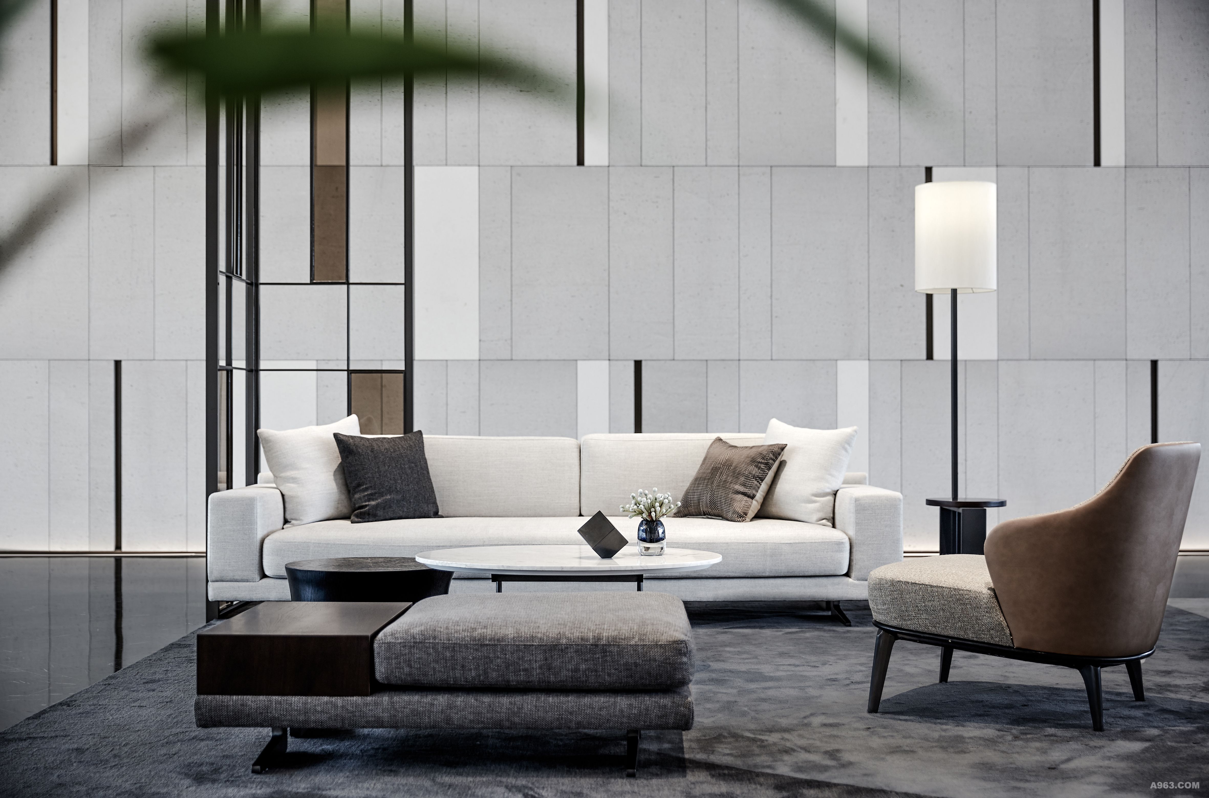
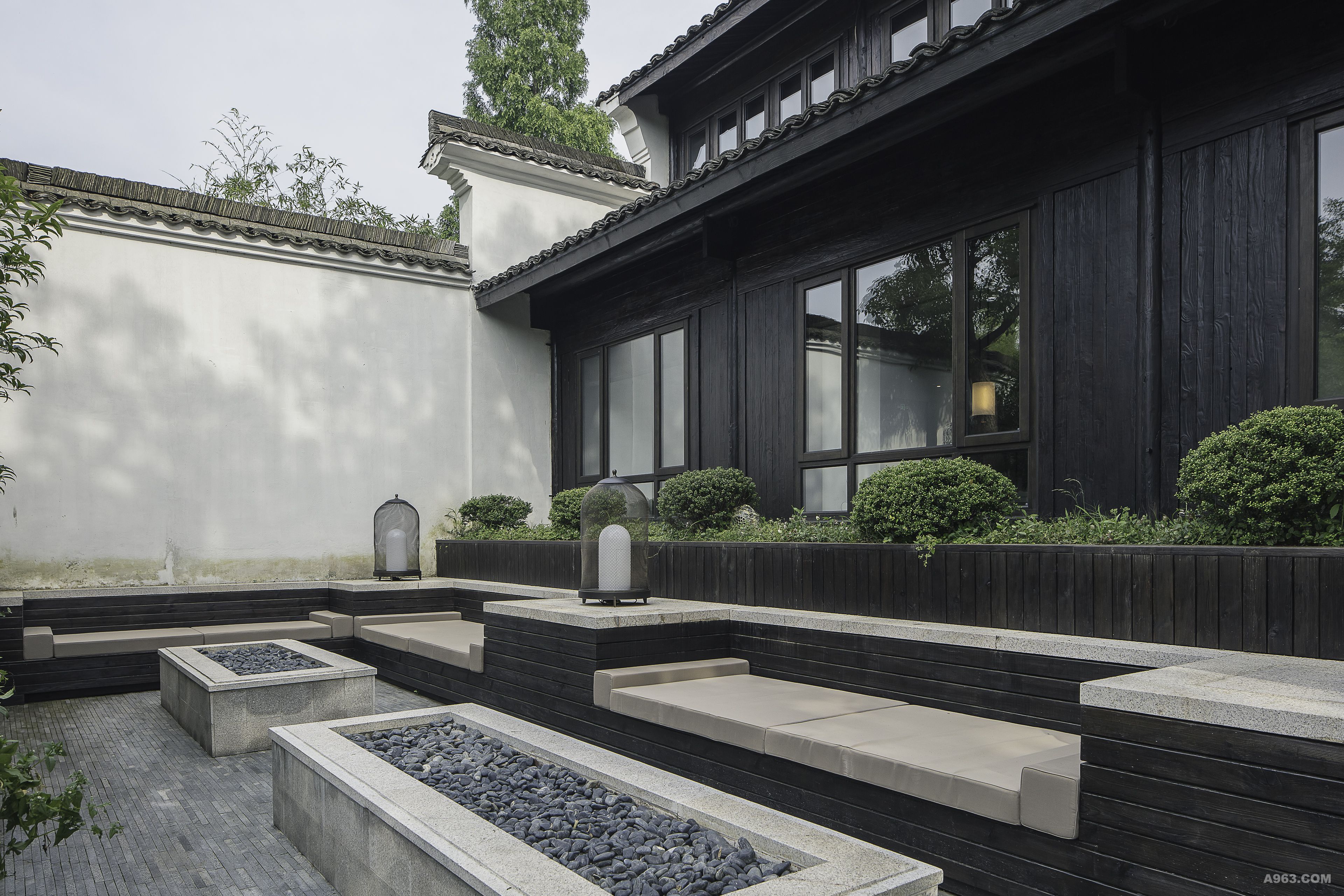
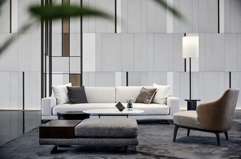
项目虽为江南城市杭州的商业建筑,却以国际化、艺术化的江南民居形式,展现独特的水乡在地文化,成为一座城的建筑符号。
The project involves a commercial building in Hangzhou, in the south lower reaches of the Yangtze River, but it is presented through international and artistic forms, integrated with characteristics of residential houses in the south lower reaches of the Yangtze River, showcasing water towns' unique culture, and serving as the city's signature architecture.
项目设计中,处处呈现江南传统文化元素的活用。
The project perfectly incorporated factors and elements of traditional culture of the south lower reaches of Yangtze River into its design.
中国江南多烟雨,传统民居屋顶往往呈“人”形,设计师提炼这一元素,以灵动的、流畅的线条筑造“人”形屋脊,室内天花随屋脊的节奏起伏也呈“人”形。为强化空间内的“人”字符号,大理石地砖的铺排方式也呈“人”形。
Considering the adoption of herringbone roofs in houses located in the south lower reaches of Yangtze River due to prevailing rain and fog, designers capture and adopt the element of “herringbone roof” through dynamic and smooth lines, generating a herringbone-shaped ceiling inside. To highlight symbol “人” , floor marbles are laid in the arrangement of “人”.
江南民居的墙角常砌片石,设计师将拙朴的片石引入室内,以竖拼的方式贴于立面,增加空间的视觉高度,呈现江南传统建筑“墙壁高,开间大”的特点,又揭示居于天地间的人的谦卑朴实。
Rubbles which were usually laid at the corner of houses in the south lower reaches of Yangtze River, are used inside the house and are pasted vertically to increase perceived height, and create a sense of “high walls and vast space” in accordance with the characteristics of traditional houses in the south lower reaches of Yangtze River, as well as to present humility and simplicity of people living on earth.
空间色彩以灰黑为基调,茶色穿插其中,这些颜色都是传统江南民居中常见的色彩。
The project's space color are popular colors for residential houses in the south lower reaches of Yangtze River, with grey dark as basic color and dark brown for decoration.


零次方设计 | GREEN·FUN“树有洞天”乐园体验生活馆
微观森林 谷仓工坊 多元化业态

零次方设计 | GREEN·FUN“树有洞天”乐园体验生活馆
绿意盎然 树有洞天 艺术概念社区

滨海设计 现代创意售楼处
朗联设计 南宁华润 五象悦年华 健康生活馆

朗联设计 悦年华

美容院设计商业设计 袁珂设计